In today’s digital landscape, creating an engaging and user-friendly website is essential for online success. Incorporating the best website pop ups, overlays, and interstitial ads can either enhance or hamper the user experience. These components, when used properly, can increase conversions, gather leads, and give visitors useful information. However, if used improperly, they can interfere with the user’s journey, increase bounce rates, and harm SEO efforts.
In this guide, we will explore the SEO best practices for utilizing website popups, overlays, and interstitials. By following these recommendations, you can create a seamless and optimized user experience that maximizes conversions and aligns with search engine guidelines.
Different Types Of “Pop-Ups” & How They Impact SEO
While we typically refer to all of these onsite elements as “pop-ups,” there are actually some big differences between them in both user experience and how they interact with SEO ranking factors.
1. New Window Pop-Ups
A true pop-up is a new window that opens up outside of the main browser window. These pop-ups are now rarely used (except for spamming sites) for one reason; they hurt the user experience and damage website navigation. You’re most likely not using a true pop-up, but on the off chance that you are, you should definitely stop. Google and other search engines do not like new window pop-ups.

2. Overlays
We call them pop-ups, but they are actually considered overlays. (Can you blame us? This is an SEO post, after all.) An overlay is a pop-up that opens in the same browser window and is layered on top of the page content.
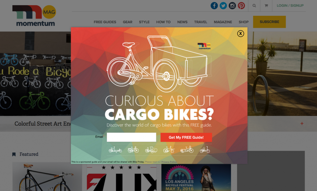
Overlays are widely accepted as an effective marketing practice for engagement and conversion while still maintaining good user experiences and navigation. Here are the most common types of overlays, along with some common use cases:
Pop-up Overlay
A pop-up overlay is typically a window, lightbox, or full-screen takeover and can be used for email capture, traffic conversion, promotional marketing, and website messaging/navigation. These overlays are effective and SEO-friendly when implemented properly. We’ll review proper pop-up use cases later in the post.
Notification Bars and Banners
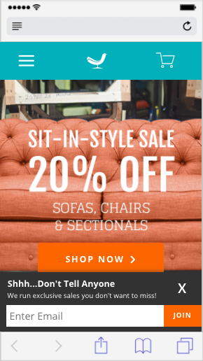
A bar or banner is an overlay that sits at the top or bottom of the browser window and is a great tactic for globally displaying important messaging, bringing attention to certain landing pages, and as an effective email capture method on mobile browsers. Here are 15 examples of the most effective use cases for website banners that you can implement on your site.

Here’s a great mobile notification bar used for email capture on Joybird. As you can see, the majority of the page content is visible, and the close button is clearly in view. These are great practices to consider using when marketing with overlays on mobile browsers.
Slide-Ins
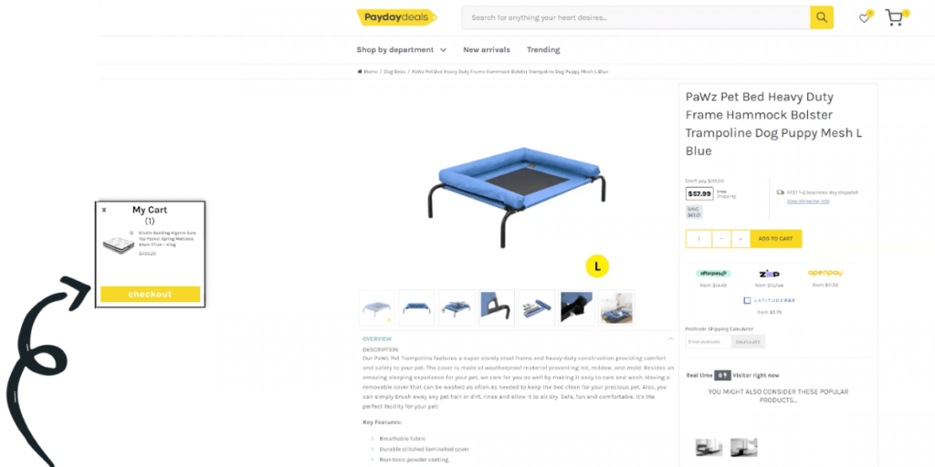
A slide-in is essentially a corner overlay that can be used for virtually anything listed above. The benefit of a slide-in is the ability to draw attention to your overlay without it covering up potentially important content. Keep in mind that the prime real estate and cover-up of page content are why a pop-up overlay drastically outperforms banners and slide-ins. There’s a place for all three in your marketing strategy.
3. Modals
A modal window is very similar to an overlay but is typically used for important or required actions. For example, cookie usage agreements, age verification popups, and login windows would all be considered modals.
These are typically SEO-friendly because these actions or notifications are important to the user experience.

4. Interstitials
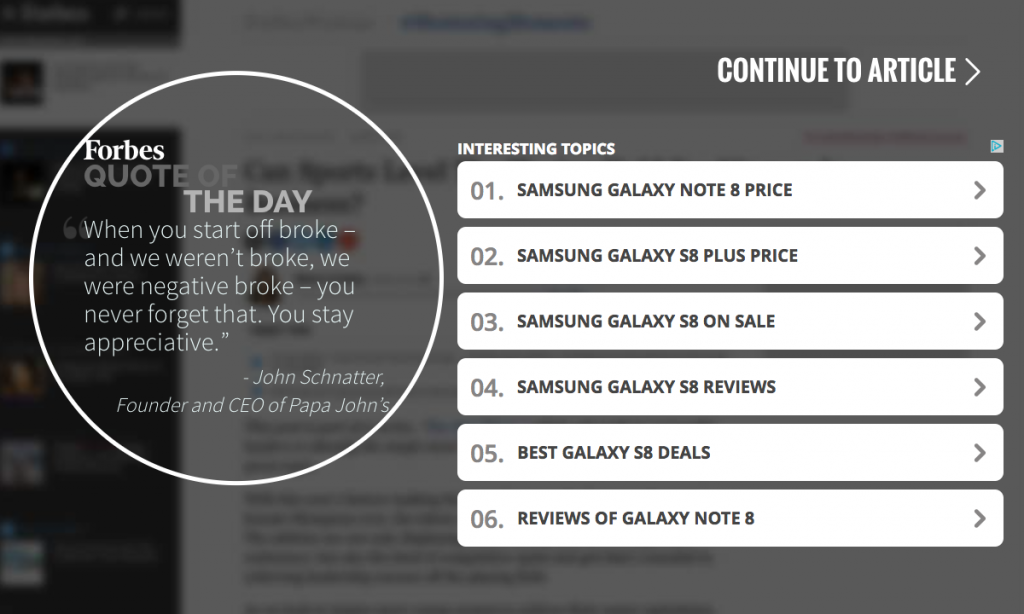
You’ve probably been served up an interstitial on PCMag or Forbes. Interstitials are typically a window that covers up the page content and requires a certain wait time before a visitor can view the content. Google is going to penalize the use of interstitials because it definitively restricts visitors from accessing the content they searched for. Many big sites that use interstitials have either been heavily penalized in SERP rankings or have begun to remove interstitials from their site.
So, what are the best website popups? We would recommend using overlays and modals and avoiding new window pop-ups and interstitial ads.
Conclusion: Use Overlays and Modals. Avoid New Window Pop-ups and Interstitials
Factors To Consider For SEO-Friendly Pop-Ups
Now that we know that we should be using overlays and modals, let’s review the search engine factors that determine the correct usage of these tools and guarantee a good mobile UX.
1. User Experience
Why does Google continue to keep us on our toes with new SERP ranking factors and AdWords policies? It all comes back to improving the user experience. They want to control the experience from search and search results to the first-page load of the destination site. It makes complete sense because that is their most widely used product, and want to improve it.
Want to be in compliance with Google? Make sure the content of the search result is accessible on the first-page load. Hold off on the overlays and modals until the second-page load. There are some unique cases to consider when it comes to timing. We’ll discuss those next.
2. Timing
Since we’re talking timing, let’s revisit the first-page load versus the second-page load. The very first page visited from a SERP page is what Google is ranking. You could say that they have some control over that experience. But, after that first-page load, you control your website experience and are free to market with overlays and modals how you’d like.
Other things to make note of are delayed triggers, action-based triggers like percentage of page scrolled and CTA click, and of course, exit behavior. The jury is still out on how Google is factoring this in, but it’s important to note that it is being treated differently than if an overlay were to open immediately after a visitor clicks through from a SERP.
3. Content
The content of the element displayed is also going to factor into SERP rankings. If the content is prompting a visitor to take a required action, like verifying their age, a legal agreement, or logging in, you’re typically going to be fine. If it’s part of the user experience, this should be in the clear.
However, if the content is an ad, this is a definite no-no. This is something Google has been trying to get rid of and is viewed as a bad practice for digital marketers.
4. Interaction
This refers to the many different ways that a visitor would interact with the element. Since content readability and navigation are focal points, the website element must be able to be closed easily and not restrict the visitor from the content.
The other aspect of interaction is the visitor’s behavior and action on site. If an overlay opens when a visitor clicks a CTA, that’s part of the website experience and should be fine. Scroll triggers are a popular marketing tactic and should still be in compliance. As we gather more information on action-based triggers, we’ll keep you updated with the best practices.
5. Traffic Source
This is going to clear up a lot of confusion out there. No, pop-up overlays are not dead, and here’s why. These changes only apply to organic search traffic and paid search, nothing else. This means that traffic from social, email, referral, and direct sources aren’t at all affected because Google doesn’t control them.
Still, we can learn quite a bit from Google’s criteria and apply that to bring about a better user experience for our visitors. We’ll get to proper use cases soon.
6. Device Type
Way back in January 2017, Google updated its policies regarding mobile pop-ups, overlays, and interstitials to bring about a better mobile search experience. The mobile browsing experience is completely different; therefore requires a different design and different user experience.
Since Google seems to be taking a similar approach to the desktop search experience, there’s no longer a huge difference in how pop-ups, overlays, and interstitials should be used differently on mobile, but we’ll fill you in on the best practices in the next section anyway.
How To Keep Pop-Ups From Harming Your SEO
We’ve covered a lot in this post, but now it’s time to put it all together. Below is a list of SEO-friendly best practices for popups. Use these strategies and tactics when setting up your campaigns for a better user experience and SEO-friendly marketing!
1. Avoid New Window Pop-ups And Interstitials
This one is simple. Google penalizes both new window pop-ups and interstitials that restrict access to content, so avoid using them, and you’ll be good to go!
2. Avoid Triggering On The First-Page Load From Search Engines
Google wants to make the searched content more accessible on both mobile and desktop, which means that rankings could be affected if an element shows on top of the main page content.
To ensure that you’re in compliance with this, don’t trigger a pop-up overlay to display on the first-page load from the SERP page. You can display a pop-up overlay on the second-page load because it’s no longer a search result.
Also, if you want to engage traffic on the first-page load, display a banner at the top or bottom of the browser window. This will allow for personalization and messaging without intruding on the visitor experience.
3. Segment Based On Traffic Source
By now, it should be clear on the different ways to use overlays and modals correctly when marketing to organic search traffic. If not, check out the paragraph directly above this section.
With this in mind, we should also look at all of our other traffic sources. Your website experience can cater to each traffic source differently depending on what your goals are.
For example, traffic from a marketing email should receive different messaging than a first-time visitor from Facebook. We highly recommend using UTMs to optimize the results of all your campaigns (paid or not) to provide a better website experience with personalization and relevance. Plus, here’s a helpful article on how to target visitors from specific traffic sources.
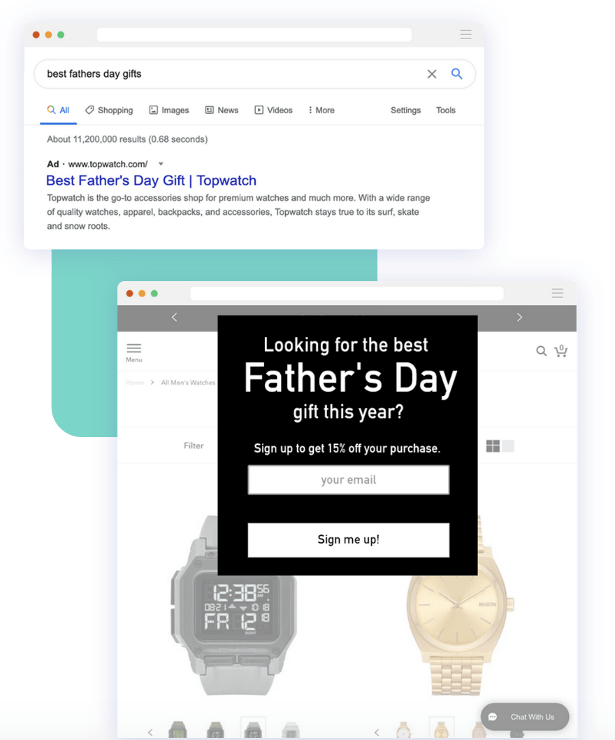
4. Target Browsing Visitors Upon Exit
One of the main reasons marketers use overlays in their marketing is to increase traffic conversion. Since we have limited means of engaging search traffic upon entry, let’s make sure to target visitors who are leaving with an attractive offer. Use exit indicators to target leaving visitors with something of value. If you’re concerned about displaying an exit offer on the first page from a SERP, set it to trigger when someone attempts to exit on two or more page views.

5. Treat Mobile Differently
This is essentially the same practice as listed above, but mobile deserves its own section. Here’s a cheat sheet to show you the proper and improper use of pop-up overlays on mobile sites. This should clear up any questions you have about mobile best practices for Google Search.
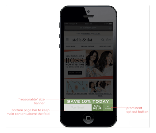
One other key thing to note here is the mobile pop-up design. The mobile experience is different, so the design should be tweaked to suit the browser better. These key changes in design should be made specifically for a smaller display:
- Different shapes of the pop-up
- Stacked email field and CTA
- Larger close button text
If you want to optimize not just your mobile experience when it comes to pop-ups but email and SMS marketing as well—our Mobile UX Checklist is your go-to resource!
Create SEO-Friendly Pop-Ups Using Justuno
You made it through a crash course in SEO! You can now take this info and apply it to your search marketing and content marketing strategies. Hopefully, this article helped answer all of your questions on the topic of pop-ups and SEO.
Interested in using SEO-friendly pop-up overlays? Justuno has exactly what you’re looking for:
- Design and customize overlays to meet your exact specifications
- Target traffic sources, visitor actions, and more to create SEO-friendly campaigns
- Targeting rules based on device type for desktop and mobile traffic to get their own browsing experience
- SEO-friendly templates
- And much more!
Start a free, 14-day trial to get started today, or book a demo to get advice specific to your SEO needs!
The Bottom Line
In conclusion, for maintaining a user and search-engine-friendly online presence, it is essential to adopt SEO best practices for website popups, overlays, and interstitials. Website owners can optimize their sites for both user pleasure and search engine exposure by finding a balance between engaging users and emphasizing their browsing experience. To avoid interfering with the user experience or preventing access to useful material, popups, overlays, and interstitials must be utilized sparingly, appropriately, and intelligently.
Adhering to rules like responsive design, clear exit options, and loading time optimization can improve user experience all around and have a beneficial effect on search engine rankings. Website owners can effectively employ popups, overlays, and interstitials to engage consumers without compromising organic search visibility by putting these SEO best practices into practice.


