What is Shopping Cart Abandonment?
Shopping cart abandonment is when a would-be customer leaves a website after adding products to their cart, but before they make a purchase.
Of course, cart abandonment is then a revenue-decreasing issue. Luckily, there are strategies including pop-ups known as exit offers that are proven to be effective in reducing cart abandonment and saving your revenue.
What is an Exit Offer?
An exit offer is a promotion that triggers when a user’s behavior indicates they’re about to leave the site.
Using pixel tracking, these exit offers are able to ‘catch’ the user before they leave and possibly save the sale. On desktop, this often means the mouse is moving towards the corner of the screen or on mobile, it’s defined as using the back button.
By offering a steeper than normal discount or offer, these exit pop-ups can result in upwards of a 10% conversion rate.
How to Reduce Cart Abandonment With an Exit Offer
Placement
The placement of an exit offer doesn’t vary much, if at all. The purpose of this exit pop-up is to prevent the user from leaving your store, and so it should be anything but subtle.
We recommend placing your exit offer dead center of the page, overlaying (and perhaps darkening) the rest of the screen.
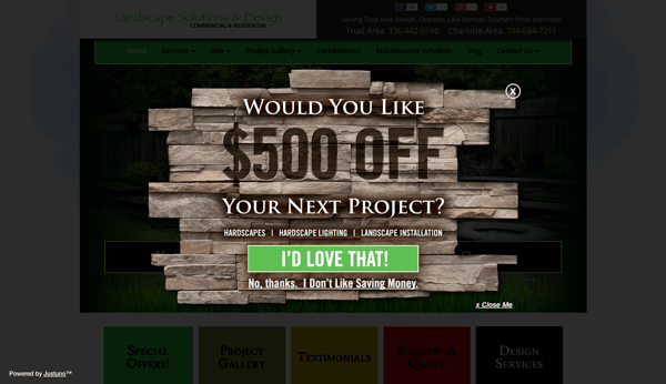
It is important to note that the offer should not cover the entire screen, but should be large enough to be easily noticed like the example below.
Darkening the screen behind the pop-up is a great way to increase contrast, a key element in the design of your promotion, which we will talk about in the coming sections.
Design
The design of your pop-up will often mean the difference between whether or not the user even takes a look at your promotion before they leave.
Needless to say, if you are trying to retain that user and convert them into a customer with your offer, the design elements need to hit the nail on the head.
Here are a few design best practices:
Contrast
Contrast is important to the subconscious side of this exit offer strategy.
High-contrast elements, such as black lettering on a white background, not only makes the elements easier to see but also makes them more noticeable in the periphery.
While your user is motioning toward leaving your site, they are focused on making that action.
Just like hearing a loud noise while you’re walking down the street, the contrast has to be drastic enough to grab their attention.
Put in fishing terms, think of contrast as the bait.

Visual Appeal
An exit offer is already a last-ditch effort, and one that you should be throwing everything you have into.
Exit offers with eye-catching visuals and/or an appealing image or style are much more likely to be noticed.
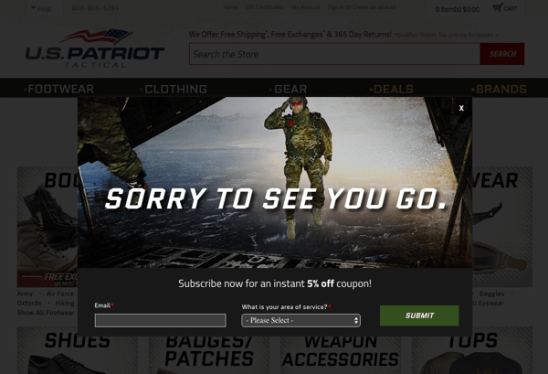
You can create this appealing element by using quality images or vibrant colors and illustrations like the example below.
Using the same fishing analogy, think of visual appeal as the hook.

Positive Messaging
One pitfall that many marketers make when designing this promotion is using “confirm-shaming”.
Confirm shaming is where the pop-up messaging degrades the user for not accepting the offer or trying to leave.
The best practice here is to ensure that you are using positive (or at least neutral) messaging, and to ensure that you are creating a positive brand experience.
You can use funny or joking language, just make sure you fully understand your target audience and know what will appeal to them. Don’t force something that isn’t there!
Finally, think of positive messaging as reeling in the fish.

Close Button
The final and key element to an exit offer is the use of a close button.
While it may sound odd, it’s important that you offer your customers a way to clear the pop-up without having to engage in the desired action–it creates a smoother user experience and even if they close out of the pop-up this time, they’ll have had a positive experience with your brand.
If you don’t include a close button and force the engagement, it’ll likely leave a bad taste in their mouth and make it even less likely they’ll become a customer (or even return) in the future.
Timers
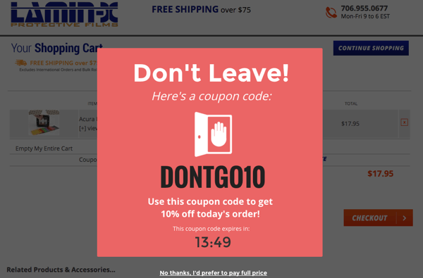
Timers are another layer you can add to your pop-up design that not only add an animation element (counting down) but they also rely on the psychological pull of FOMO and create a sense of urgency.
If a visitor feels like they can leave your site to shop around and come back later if they don’t find a better deal, they’ll probably leave anyway.
Attaching a countdown timer to your exit offer makes it a ‘convert now or risk losing out’ situation, this makes visitors take a beat to consider if they’re willing to risk it and likely convert on that session.
Offer
Naturally, the offer is going to make or break your promotion and ultimately decide the end result.
We recommend a higher than normal offer, one that will really make the user think before they decide to continue on and leave your site.
If you have a series of promotions that a website visitor has already engaged with (Welcome visitor offer, traffic source specific offer, etc.) you can set up your exit offer to offer a slightly higher incentive.
This alone will help the exit offer stand out from the crowd.
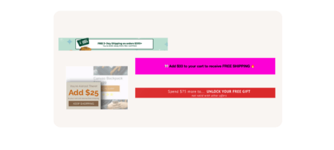
Pro Tip: Try A/B testing offers to see what works best for your audience and try to get to the root cause of the abandonment. For example, maybe it’s unexpected shipping costs that’s driving visitors to abandon their cart. You can combat this by creating free shipping offers for those exiting directly from the cart page or even a free shipping threshold banner to let them know what they need to do before they get that far.
Of course, the offer is going to vary per store depending on your individual numbers and what you can afford to offer.
Ensure that you take into account how many abandoned carts you typically have, what the value of those purchases would be, and how your offer would impact the profit of each order.
High Abandonment Products
Sometimes there will simply be products that have higher abandonment rates than any others.
These pages may be attracting window shoppers (someone with low to no intent to buy), have something wrong with the page itself (bad product photos, bad reviews etc.), etc.
You should monitor your website’s analytics to keep an eye on these products and test exit offers to find what solves the problem!
With Justuno’s Google Analytics integration, you can easily and seamlessly track the performance of your promotions in great detail.
These precise analytics include conversion statistics, audience and demographic reports, and even flow visualization, which allows you to retrace your visitors’ steps and learn exactly how they interact with your site.
Conclusion
Exit offers are an effective way to prevent abandoned carts, and save sales. There are a few considerations involved, but overall this strategy is not a difficult one.
Justuno makes it easy and seamless to integrate these promotions and more into your stores, track and improve their effectiveness, and increase overall conversion rates.
You can even track your individual URL performance to find those highly abandoned products to re-capture revenue from.
With tools like Justuno’s Google Analytics integration, tracking these promotions and their effectiveness is easier and more detailed than ever before.
Check out our exit offer pop-ups and other promotions and tools at Justuno’s Exit Offer & Cart Abandonment Page to get started!


