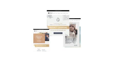
Willkommen! Bienvenue! Irasshaimase!
These different words all mean the same thing – “Welcome”. As in different languages, there is a way of saying welcome through email, too. Yet, while greetings in languages are aided by expressions and gestures, emails depend solely on content and design to get their messages across. Hence, it is essential to invest the time and effort in creating a winning welcome email.
The welcome email is your first point of contact with after a subscriber opts into email offers. It plays a pivotal role in laying the foundation of your brand’s relationship with them. In fact, welcome email recipients engage with brands 33% more than their “unwelcome” counterparts.
Need more data? Here you go:
- Welcome Emails average a 57.8% open rate compared to a 14.6% open rate enjoyed by “normal” promotional emails
- Welcome emails garner a 14.4% click-through rate compared to 2.7% brought in by other promotional emails
- Welcome emails have transaction rates 9 times higher than bulk mailings
- Welcome emails boost the average revenue per email by 30%
- 1 in 4 new customers makes a purchase after clicking on welcome emails
Most customers expect a welcome email when they subscribe through a form or email signup pop-up. Therefore, this crucial first impression with your new subscribers is one opportunity not to be missed! In fact, when new subscribers don’t receive a welcome email, they often wonder whether the sign-up was successful or not.
What makes a good welcome email
The short version
To create a great-performing welcome email, keep these points in mind:
- Introduce your brand to your audience
- Establish expectations for what and often you’ll message your subscribers
- Match the design, tone, and content of your welcome email with that of your brand promise
- Highlight and reinforce the reason(s) your subscribers signed up in the first and possibly incentivize them to make a purchase right away
- Create a sense of community among your subscribers by linking them to your social network presences and other great spaces for content and connectivity
The long version: What Are Welcome Email Best Practices To Follow?
Let’s walk you through some best practices as we highlight some examples from popular brands.
1. Begin with a warm welcome followed by an introduction
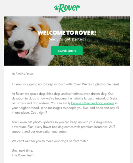
Rover, one of the largest network of 5-star pet sitters and dog walkers, keeps its welcome email pretty simple and straight-forward. They begin with a warm welcoming message followed by an introduction about their services.
Note how the copy focuses on the exclusivity of their services & how it stands to benefit the subscriber. Since Rover is an intermediary platform that connects dog owners and dog-sitters, the explanation of how the service works in the “language of the dog” is an excellent show of brand personality as well.
2. Highlight your features & USPs
Zapier, a workflow automation provider, believes in projecting its salient features and USPs in its welcome email. The email avoids other unnecessary clutter and focuses on telling the subscribers the different benefits they would get to enjoy by connecting with them. This strategy works well as a way of luring the subscribers into taking the next step.

3. Offer discounts & coupons
Welcome emails with offers bring in nearly three times the transactions as those without special offers.
Ace & Tate, online prescription glasses provider, straightaway jump into offering free shipping soon after the welcome message in its welcome email. By doing so, they are not only increasing the chances of conversion but also creating goodwill among their new subscribers.

4. Include a single CTA instead of multiple
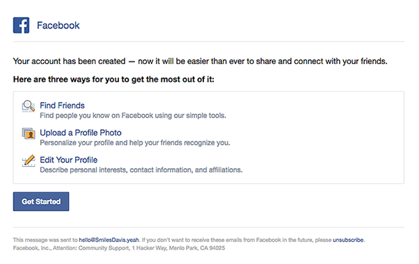
More choices can actually equal fewer decisions. It seems paradoxical, but it’s true. Emails with one powerful call to action tend to generate higher click-through rates than emails with multiple CTAs. So, make sure your welcome email has one prominent call to action that’s easy to find and act upon.
The single CTA makes Facebook’s welcome email more purposeful and makes the next step very clear to the subscribers.
5. Include eye-catching graphics & images
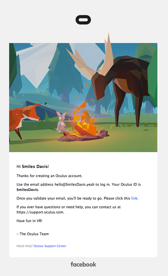
Oculus, an American tech company, uses eye-catching images and graphics in its welcome email to showcase its products/services. It makes sure that the images are compelling, emotion evoking and relate to the objective of its brand. These rich and eye-catching images & graphics make Oculus’ welcome email hard to ignore.
6. Add social media buttons
Welcome emails with links to social media have a 6% higher click-through rate than those without. Adding social media links allows you to keep your new subscribers engaged and enable them to interact with other facets of your business—ultimately (we hope) increasing the chances of conversion.
Allbirds, a woolen footwear company, provides buttons/ links to its various social media channels such as Facebook, Twitter, Pinterest and YouTube in the footer of its welcome email. By doing this, Allbirds has made its welcome email more engaging and interactive.

Final thoughts
A welcome email is a must-have piece of your overall email marketing program. Use the easy steps above to build yours. If you want a deeper dive on what makes a great welcome email, take a look at this infographic from InboxArmy titled The Indispensable Welcome Email.
