Do you have a sweet tooth for improving the conversion rate of your funnel?
In this article, you’re going to learn how MuteSix used Facebook ads, email marketing, and strategic on-site promos to help luxury floss business Cocofloss improve their conversion rate by 28% while lowering their cart abandonment rate by 20% within one month.
The problem that every e-commerce business faces
The average conversion rate for an e-commerce store in the US was 2.63% for Q2 of 2018.
Simply put, for every 100 visitors, if you manage to turn 2.7 or more of them into paying customers then you’re doing better than average.
This was the problem faced by Cocofloss.
Getting visitors to their website was easy, but getting them to move further down their funnel was like pulling teeth.
That’s when they came to us seeking ways to improve their sales funnel. This is what happened next.
The power of strategic pop-ups
The first thing we did with Cocofloss was to place strategic pop-ups at various stages of the customer journey.
Cocofloss positioned themselves in the luxury segment of their niche, so this meant we couldn’t go overboard with on-site promos which could devalue their brand image.

Overusing pop-ups can come across as spammy, and if you’re trying to rank organically in Google then poorly placed pop-ups will negatively impact your SEO.
This doesn’t mean you shouldn’t use them; you just need to be smart about when to use them.
Thanks to Justuno we were able to limit the number of pop-ups a user experiences to a maximum of one pop-up per session.
There are two components to making successful on-site promos:
- Copy – The creative needs to be engaging and relevant to the user. The copy mustn’t solely focus on the offer; it should also include the brand’s voice.
- Behavior – The on-site promo needs to be shown at the right time.
For example, you don’t show a pop-up as soon as someone visits your site as they’ve yet to decide whether your business is of interest to them, nor would you want to show a pop-up to someone who is about to complete their order as it’s a distraction.
Pop-ups for e-commerce are best used when the prospect is about to leave a website.
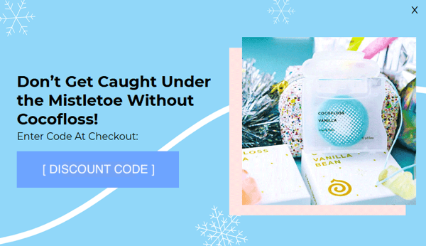
The first pop-up we created was when a visitor added an item to their cart but then decided to leave Cocofloss. This was the mobile pop-up we used:
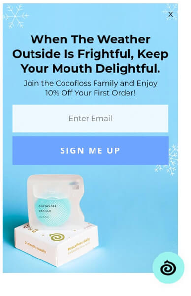
As it was the holiday season, we used a Christmas theme to catch their attention and created a Christmas rhyme using the brand voice with the offer.
The pop-up looks colorful, is funny, and does a great job of showing off the business.
You just cannot be upset if you’re on a flossing website and see that pop-up.
Now compare the quality of that pop-up to this one:
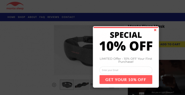
This doesn’t really raise any excitement or FOMO (fear of missing out), does it?
It actually looks spammy and sad ☹.
After entering in their email address, users are instantly presented with a discount code to use at checkout. This ensures a seamless checkout experience as they don’t need to leave the website to check their email.
A few minutes later a triggered welcome email is sent via Klaviyo to their inbox in case they were busy and didn’t have time to finish their order.
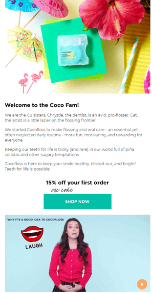
The email follows the same principle as the pop-up. We lead with an introduction to who is behind the business, some cool imagery, and a small offer.
We tested various on-site promo messages and we found that fun and seasonal creatives did much better than if you just hammered home on the discount or saving.
If users added more items to their cart and had a higher cart value, we were able to serve pop-ups with greater offers to turn them from a visitor into a prospect.
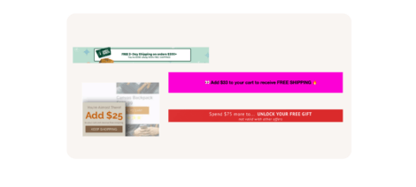
Here’s a desktop banner shown to users who had higher cart values but were about to leave before checking out:
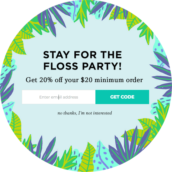
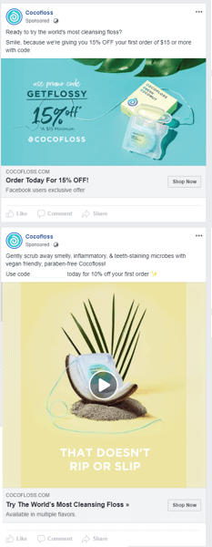
Depending on the Facebook ad a user clicked through, using Justuno we were able to edit our on-site promo copy to reflect the offer. This really helped to keep the marketing scent through the entire journey smooth.
We ran ads that offered 15% off with a minimum spend of $15 and a flat 10% off without a minimum spend. Being able to segment our pop-ups and emails by offer gave us deeper insight into which offers resonated best with which audience demographic.
Email marketing: catching the second wave
When a visitor provided us with their email address and still didn’t complete the checkout, we created a two-tier cart abandonment series.
The first email was sent two hours after signing up if they had yet to place an order.
The email was a reminder that we saved their cart in case life got in the way and they forgot to order.
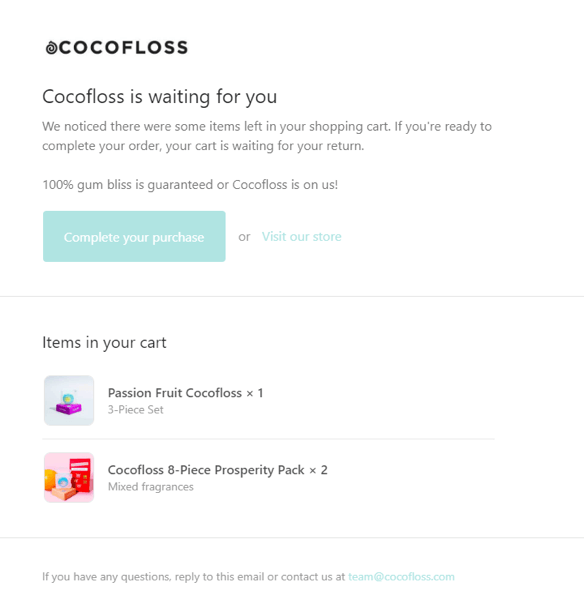
If 24 hours passed and the visitor was still yet to place an order, they were sent a second email, this time with a 15% off voucher to help them cross the line.
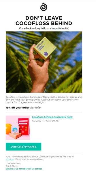
It’s not uncommon for shoppers to conduct some research online before making a purchase. I’d advise keeping a 24-hour delay before sending your second cart abandonment series.
Try to avoid sending your second email between the hours of 11 pm and 7 am as people are asleep and your email may be pushed down their inbox when they wake up.
If the visitor still didn’t complete the checkout, then they would be entered into a welcome series automation where they can learn more about the business with the goal of overcoming any objections they have to try out Cocofloss.
May the floss be with you
Most marketing teams understand the power that email marketing and strategic on-site promos have on conversion rates, but very few are able to take the correct actions to see their conversions skyrocket.
With Cocofloss we were able to hyper-personalize the customer experience from the moment they interacted with the business on Facebook, to what offers they saw on the website, to the emails they received.
This level of personalization combined with Cocofloss’s brand voice at each step was what allowed us to collect 2,096 emails in under a month, reduce their customer acquisition cost by 25%, and lower their cart abandonment rate by 20%.
Download the full case study!
To read more about the details of the full-funnel marketing campaign MuteSix orchestrated for Cocofloss, click below to download the full case study.

