Will you marry me?
… Probably not.
Let me try that again.
I’m a millionaire and I have a great personality ?
… How about that marriage now?
Okay, you might still need a bit more info before going along with this. But that second offer is definitely more enticing, right?
You have no reason to commit to the first, thoughtless proposal. You don’t know anything about me yet. So this is the wrong question to ask, at the wrong time, and definitely the wrong way of going about it.
Chances are you’re doing something similar with your site’s lead capture promotions.
If you want to successfully capture emails and increase conversions, you’ll need to be more thoughtful about your pop-up offers.
That’s what we’re focusing on today–finding a compelling incentive that your ideal customer will be dying to receive.
We’ll start by answering these four questions:
- Why do you need a pop-up offer?
- When is the right time to make your offer?
- What should you offer?
- How should you present the offer?
Then we’ll walk you through some example lead capture pop-ups.
By the end, you’ll have the magic formula to capture heaps of leads.
1. Why do you need a pop-up offer?
The answer might seem obvious, but it’s essential to think about what you want to achieve with your promotion.
The goal of a lead capture pop-up is to capture leads… but you don’t want just any leads. We’re interested in emails that you wouldn’t be getting otherwise.
Your store gets emails in two different ways:
- When people subscribe to your newsletter
- When people buy.
We’re interested in traffic that doesn’t do either on their own.
A majority of your traffic will land on your store (after you may have paid a lot to get them there), and leave without a trace… unless you get their email contact.
Your goal should be to capture their contact info so you can start a conversation and convert them into customers rather than let them leave as anonymous traffic.
To help you along, we created this handy email checklist that will guide you as you start a conversion. Download it here.
2. When is the right time to make your offer?
Next, you need to figure out when to present your offer. The two most common promotions types are 1) welcome pop-ups, and 2) exit prevention pop-ups.
Welcome pop-ups trigger almost as soon as someone lands on your store (usually triggered after 30-60 seconds of activity). Exit prevention pop-ups trigger when a visitor indicates they’re about to leave your site (i.e., the cursor moves outside of the browser or on mobile they go to use the back button).
We always recommend exit over welcome pop-ups.
Welcome pop-ups barely give your new visitor time to get to know you. You’re rudely interrupting someone who just got to your store and hasn’t had time to browse your products.
The problem with this approach is that emails you do collect may not be high-value leads since they don’t know who you are yet and likely aren’t ready to engage with your brand.
On top of that, some of your visitors enter with the intention to buy. By interrupting their browsing with a welcome pop-up, you’re distracting them from placing an order and losing margin by giving away unnecessary discounts.
Remember from earlier that your goal with this offer should be to collect the email addresses of visitors who need that extra push to opt-in or buy.
That’s why we recommend the exit prevention route. This way, you only show an offer to those who were leaving your site empty-handed.
3. What should you offer?
The perfect offer is both relevant and as tangible as possible.
You might be thinking:
“But, isn’t 10% off universally relevant to every shopper? Everybody wants to save money.”
Not so fast.
If your target audience is price sensitive, then maybe a discount is, in fact, the most relevant offer. But chances are your visitors will get much more excited about something different. Something that adds to their experience rather than subtracting from it.
To find a relevant offer, you need to define your target customer. Ask yourself this:
- Who are they?
- Why are they on your store?
- What problem are they trying to solve?
A relevant offer has the power to both delight and help your target.
As you’re thinking of relevant offers, try to go for something tangible. You want your customer to see themselves taking advantage of it.
Let’s say you sell natural skin care; you could give away a free face mask with all first orders in exchange for an email address. If your visitor cares about their skin, what’s not to love?

Or what if your typical customer enjoys your blog articles? You could share an exclusive piece of educational content to attract new customers and build trust.

If your products have a natural upgrade option, such as gift wrapping, you could offer that for free to augment their unboxing experience.

You could also create a contest with a juicy prize if your audience is the gambling type… or you could even create a quiz!
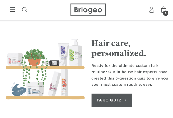
There are so many options for customizing your on-site pop-ups and promotional messaging.
This type of lead capture can do so much more than simply snag an email address. It helps establish trust and long-term loyalty. You’re not desperately trying to get the first sale by devaluing your brand with discounts.
You’re starting a relationship.
4. How should you present your offer?
Now that you’ve picked a relevant offer – how will you wrap it up and present it?
The most common pop-ups look like this:
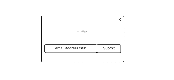
Right from the start, your reader knows that you expect something from them: their email.
Instead, we like to use an essential sales concept here: Value First! We want to offer something valuable to raise interest before asking for anything in return.
That’s why we use a three-screen strategy.
- The first screen (or “Intro Screen”) presents the offer with two buttons: one to accept, the other to decline.
- The second screen asks for an email.
- The third screen is a confirmation with instructions.
This means the reader only sees the email field after accepting the offer.
This strategy is based on the theory of commitment and consistency. Once the reader has decided they want your offer, they’ve made a micro-commitment by clicking the “yes” button. As a result, they are more likely to be consistent and follow through by providing their email address.
Let’s take a look at a few more examples
Looking at some of our most recent partnerships will give you an idea of what all of this looks like in action.
Free lip balm from Eczema Honey
Eczema Honey sells a variety of eczema relief products. They started with their Original Skin-Soothing cream and have expanded to deodorant, lip balm, bath bombs, and much more.
For Eczema Honey, we used an exit-intent pop-up and offered a free lip balm with purchase.
Why? Because a new visitor can get excited about “[keeping] their lips soft, smooth & healthy with this lip balm made from beeswax & honey, with a refreshing hint of mint & lime.”
Honestly… isn’t that more enticing than “10% off?” ?
Here’s what it looks like:
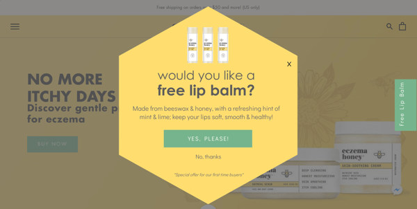
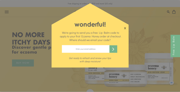
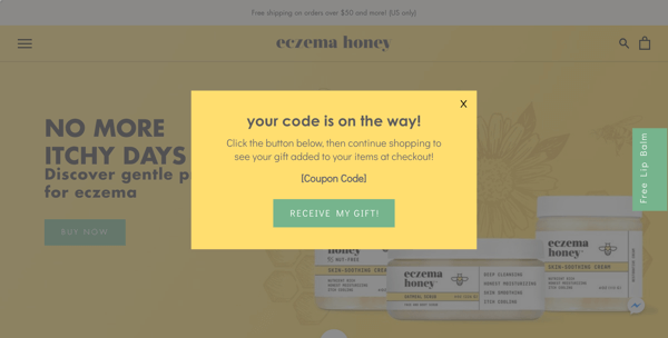
If we break this down into three steps, you’ll see our strategy in action.
- Value on the Intro Screen
- Logical request for an email address
- Facilitate a conversion. Thanks to Justuno, we can automatically add the free lip balm to their cart. This means your new subscriber doesn’t even need to leave your store.
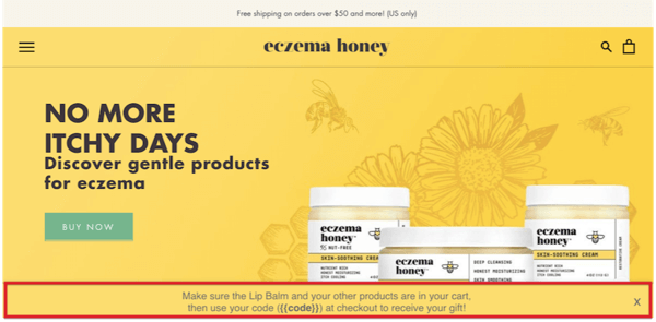
Once they sign up, we remind them of their discount throughout their shopping experience with this bottom banner:
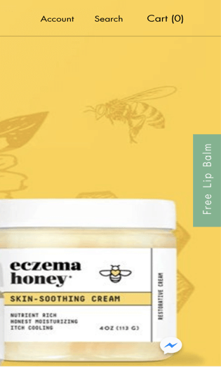
But if they close the offer and change their mind later on, this Justuno Reminder Tab hangs tight on the side of their screen to reopen the offer:
Bonus: If you use Shopify and Klaviyo, Justuno can present a different code to every new subscriber. You can also send this custom code to Klaviyo to add it to your follow-up email. As you can see from the statistics below, this free gift was a winner for Eczema Honey.
Desktop Capture Rate: 13.83%
Desktop Conversion Rate: 33.84%
Mobile Capture Rate: 26.67%
Mobile Conversion Rate: 33.69%
Free wristband from Active Faith Sports
Active Faith Sports sells Nike-quality sports apparel, with inspirational Christian messaging.
Mat is their ideal customer. He’s a Millennial. He’s cool. He’s athletic. He goes to CrossFit on Saturdays and Church on Sundays.
Once again, we could devalue the brand by giving Mat 10% off his first purchase. Or, we can offer him a free wristband, the same one worn by his heroes on the field (i.e., Steph Curry).
After picking his favorite color, Mat can wear this wristband during his basketball games to represent his faith, be closer to his idols, and…be a brand ambassador for Active Faith Sports.
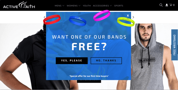
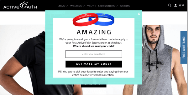
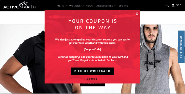
This three-screen series for lead capture worked exceptionally well on Active Faith Sport’s target customer. The lead capture rates and conversion statistics below show that they chose well when it came to picking a compelling incentive for their visitors.
Desktop Capture Rate: 5.41%
Desktop Conversion Rate: 44.07%
Mobile Capture Rate: 14.76%
Mobile Conversion Rate: 80.05%
Final thoughts
When you start putting more thought into your offers, you’ll quickly see just how fun and valuable it can be for you and your visitor. You can test different ideas, gradually learn more about your audience’s preferences, and then re-purpose this knowledge.
Everything we do at Fuel Made focuses on Customer Experience Optimization–this is our key to client success.
You might have heard that people hate pop-ups. However, if you prioritize customer experience, your audience will appreciate the promotions they’re served because they’re getting: the right offer, at the right time, and in the right way.
