You may have heard the location is everything when it comes to real estate; well, timing is everything when it comes to lead capture.
The secret sauce for successful on-site promotions is finding the sweet spot for adding value and not annoying online shoppers all at just the right time to close the sale. Let’s take a look at two foundational promotions, the best times to use them and how to create pop-ups that add value to your site’s experience.
Welcome promotions
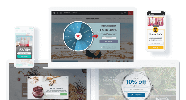
Whatever you do, do not have one of these trigger as soon as someone lands on your site. There is nothing more annoying than having someone ask for your email before having a chance to look around and see what a website is about.
We recommend setting a time delay for welcome promotions for 7-15 seconds before having a welcome promotion fire. You could also do this as pages traveled or for mobile, percent scrolled down the screen. These are reliable indicators of interest and engagement, both of which are important to identify those with strong buyers intent.
These welcome promotions are also most successful when done with some sort of incentive (AKA lead magnet) attached to the email opt-in. Free shipping, percent discount, free gift, etc. are all possibilities–the sky’s the limit in terms of incentivization. Just keep in mind that here the incentive is geared toward first capturing the email, not necessarily the same session sale.

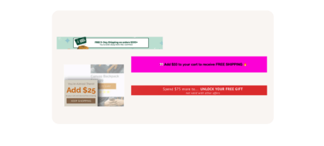
When developing a promotional strategy overall, make sure to think about how each pop-up will tie into the others you have on your site. For example, you can have Welcome Promotions work in a tiered system with other foundational promotions (Welcome, Cart Abandoner, and Exit) each building on the incentives offered. A 5% welcome offer, Free Shipping on Cart abandoners, and 20% off on exit. These offers are designed to equal the value of the action, the more they move through their journey, the more an incentive is worth.
Exit offer promotions
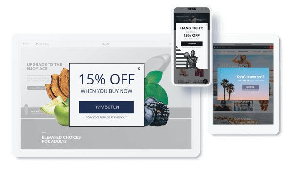
First things first, don’t try to capture emails with an exit prevention pop-up. Lead capture defeats the purpose of this type of promotion, which is to entice shoppers to stay on your site. Asking for them to type in their email is making them do work, and if they’re on their way out, you probably won’t get their email.
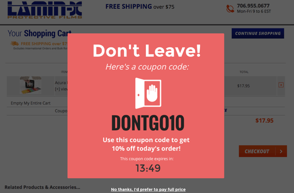
One type of exit offers are cart abandoner promotions, and these are a critical one to get right. In the cart is one of the closest places a shopper can be to purchasing, so give them an incentive to convert right there and save the sale.
Don’t lock the incentives on these promotions because this is the time to get an immediate conversion (if they buy, you get their email anyway). This is also not a great time in the customer journey to use gamification. Gamification is an engaging way of pulling customers in, but it requires more effort on their part. That’s one of the reasons why we don’t suggest it for exit prevention or to use during the holidays--these are the times to reduce customer actions not require them.
As far as design principles for these exit offers, we recommend for a best practice a center pop-up. This is the most eye-catching and forces the customer to take a beat before clicking out.

The elements of an exit offer pop-up should be bright, clean, and clearly state your offer’s value. Another way to encourage visitors to check out is to use our count-down timer feature. This drives urgency and encourages visitors to take a minute to consider your offer because it won’t necessarily be there when they come back.
There are many ways to convince customers not to leave, abandon their cart, and have the same session conversion. Playing around with your pop-ups features while A/B testing the changes is going to be the best way to find the best sale saver. The techniques that work well on other sites won’t always translate or work as well for you.
Final thoughts
Remember the tips and practices we suggested here today aren’t going to be true for everybody. We always encourage A/B Testing promotion changes one at a time, but the information above is true for 99% of e-commerce stores.
Having thoughtfully designed welcome and exit promotions are one of the most basic ways to improve your on-site conversion rates. These are the bookends to your site’s user experience, so it pays to make them as optimized for conversion as possible.
If you aren’t a Justuno user, start your free 14-day free trial and start converting today!


