I recently hopped in on a webinar about increasing revenue from Klaviyo, hosted by one of our partners here at Justuno, Austin Brawner.
When teaching about conversion from email, Austin really knows his stuff. In this webinar, he gets into why all pop-ups aren’t created equal.
Meaning some pop-ups may appear to perform better than others, but are the leads being captured good quality leads?
Let’s explore Austin’s theory alongside some Justuno data analysis, shall we?
The value of an email vs. the value of a high-intent email
When learning about pop-up lead capture, it’s crucial to understand the value of email acquisition. This is – by far- the highest converting marketing channel you have at your disposal.
Email marketing delivers an ROI of $44 for every $1 spent! Those are some great margins to take advantage of.
Once you begin capturing emails, you have the ability to segment and market to these people over a long period of time (lead nurture).
BUT, what happens if your email acquisition strategy becomes inundated with low-quality emails and your list is majorly populated by low-intent subscribers?
There are two possibilities:
- You can use your marketing budget and know-how to nurture these low-quality subs into future buyers/sales
- Your list becomes populated by unengaged contacts and email – the top-performing marketing channel – does NOT convert well for you
While #1 is very doable, it requires either a lot of time and/or a lot of immediate marketing budget pumped toward educating those low-quality leads into sales.
And depending on your product, this may take a long time.
For example, if your product is at a more expensive price point, a three-email sequence probably won’t be enough to convince a low-quality lead to drop $100+ dollars on your product. This is going to take some time.
So possibility #2 is the more likely situation: low quality leads = low quality list = low sales conversions from email.
Now that you understand the difference between the types of leads you can capture, let’s look at how to remedy situation #2.
Fullscreen vs. Non-fullscreen: Who has intent to buy?
All this talk about intent: what does it mean?
When looking at your conversion funnel, you have a wide first step known as “top of the funnel”. These folks are newbies. This is their first touch with your brand and they need to be convinced.
The website visitors that populate your TOFU (top of the funnel) are low-intent. They have yet to show any interest in your brand.
You can capture TOFU leads with an engaging offer like our Spin-to-Win. This type of promotion is effective because it introduces gamification to capture those New Visitor email addresses.
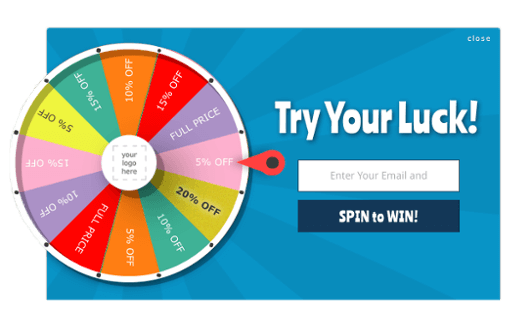
Here is where our buddy Austin makes a clear distinction: YES, this game works to capture emails…but compared to a full-screen offer, this Spin-to-Win promotion will probably return much lower-quality leads.
Why?
The goal of the opt-in, in this case, is to play a game and get a deal. It is effective. You will get email addresses. But you will have to work harder to nurture those contacts compared to a straightforward offer.
Look at the fullscreen offer below from Sivana Spirit:
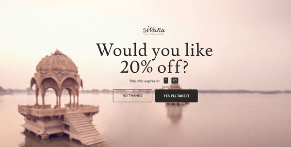
Very straightforward: “do you want 20% off?”
Their ideal customer would say “yes” to this question. Sivana Spirit also upped the ante by adding a countdown timer to create a sense of urgency.
So, there are no games here like the Spin-to-win, but making their fullscreen offer a three-step (the above image is the intro screen) instead of a two-step, you still qualify your visitors by getting them to take this first step of engagement.
When they click “Yes, I’ll take it” they are more likely to give you their email address than if presented only with a question and an email field (two-step).
Because this is not “as fun” as the Spin-to-win, your total number of engagements and opt-ins will likely be lower.
BUT, your conversions are much more likely to be higher.
Let’s look at some Justuno data to see how true that rings across our user base.
Make $15 more per conversion with fullscreen
We pulled some figures from our database to compare fullscreen offers vs. non-fullscreen on Desktop. Here’s what we found using a 1K impressions threshold and an example product price of $10:
| Desktop Only | Engagements per 1K Impressions | Engaged Conversion Rate | Example Product Price = $10 |
|---|---|---|---|
| Fullscreen | 116 | 8.8% | $102 |
| Not Fullscreen | 81 | 10.9% | $88 |
As you can see, the Engaged Conversion Rate of the non-fullscreen offers was higher.
But, looking at the conversion rate, it’s almost $15 lower than what a fullscreen offer returned.
The reason behind this is that a fullscreen offer acts as a kind of qualifier. Many website visitors don’t like them, but those visitors are usually lower-intent.
Remember the question you’re asking them on this screen? That’s weeding out people who aren’t serious or are just looking to grab a freebie.
It’s in your best interest to understand fullscreen offers and start formulating your own design to capture better leads.
How to design a high-converting fullscreen lead capture pop-up
OK, so how exactly can you create a fullscreen pop-up that will speak to those higher-intent, “middle of the funnel” (MOFU) website visitors?
Here are a few design tips and tricks that will set you up for conversion success:
Make sure the background image aligns with your brand
Can you show a product photo? Showing people/faces is nice.
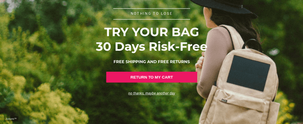
Check out this fullscreen offer from Justuno customer, Birksun. They feature their bag prominently in the design:
Weed out low-quality leads with a qualifying question
Imagine the exact person you want to buy your product: what will they have a hard time saying “no” to?
Justuno and Bluecore customer, evo, created a slam-dunk marketing campaign by using a contest to increase their pop up lead capture conversion rate. Here’s the pop-up:
They were able to capture 14,700 emails in one month! (Read the full case study here.)
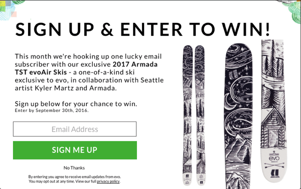
A contest with a prize is pretty hard to say “no” to if you have the right prize in mind for your audience.
Use psychology in button color and text
Make sure you’re using an actionable word or phrase in your CTA. One phrase we like is “Reveal my code”: it’s actionable and presents a bit of intrigue. Also, make sure the button you want your user to click stands out more than the “no” button. This may seem obvious, but you’d be surprised at how many brands drop the ball on this.
Add urgency with a countdown timer
As seen in the Sivana Spirit example above, this tactic could work to increase urgency in your pop up. However, it totally depends on your audience. For example, here at Justuno, we saw the opposite effect when we used a countdown timer on one of our own cart abandonment offers.
Take that with a grain of salt, though, as we are a software company and probably have a very different target audience than you :)
Start converting more from email today!
If you’re curious as to what would perform better for your audience, the best thing to do is set up an A/B test with a fullscreen vs. non-fullscreen.
Here’s how you can do that inside your Justuno account to start converting more of your website traffic!
