At last count, there were anywhere between 12 and 24 million e-commerce stores live on the internet. The actual number of e-commerce sites worldwide is not monitored by anybody, but one can say with reasonable confidence that the figure lies somewhere between those two extremes.
Let’s take the lower end of this spectrum for the purposes of our discussion. 12 million e-commerce sites worldwide means that there is 1 online store for every 600 people on the planet. If we lived in a perfect world, that would mean a steady flow of revenue from 600 customers to every single online retailer out there.
However, the reality is very different from utopian imagination. Only 650,000 (5.4%) of these 12 million generate annual sales of $1000. According to the 2015 Ecommerce Growth Benchmark Report, Average Order Value (AOV) for top retailers stands at $102 as against $75 for the average Joes. By year three, top performing online retailers receive 4x the number of monthly orders. By this time, they also have a majority of their revenue coming from repeat customers.
While the technology, knowledge base, and resources available to most e-commerce firms are out in the open, there are some secret insights that these winning online retailers are privy to that makes them so successful. Let’s take a look at these lessons in user behavior that the winners efficaciously translate into business strategy.
The bandwagon effect
The “Bandwagon Effect” is the human tendency to believe or act in a specific way because a large number of other people do so. Like sheep being herded in one direction, we tend to lean towards large groups in choosing our preferred actions in the belief that there is safety in numbers.
This “safety in numbers” is hardwired in us as a very primal means of survival.
The smartest e-commerce firms tap into this need for blending in socially, by showing users what their peers are using or showcasing popular items that they can consider buying.
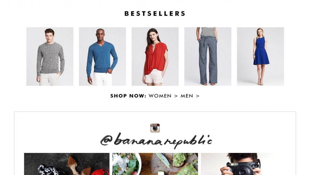
By showcasing the most popular items and telling users that these are the “bestsellers” to grab, Banana Republic subtly taps into their users’ need to conform to the latest style trends.
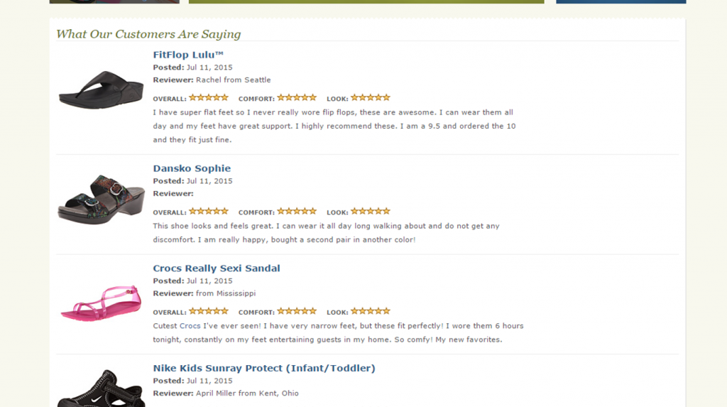
Incorporating social proof into your e-commerce site is another way to cue users about the popularity and desirability of the products showcased. While most online retailers offer detailed product reviews on individual product pages, Zappos uses product reviews by users as a way of helping users navigate to the best-reviewed items, right on their homepage.
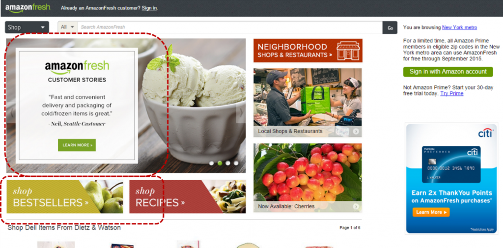
The granddaddy of e-commerce, Amazon, combines social proof and bestsellers into one screen in a bid to maximize the bandwagon effect:
Creatures of habit
This behavioral aspect has two parts to it:
- As people, we like our comfort zones. Habits are convenient and easy to structure one’s life around.
- We work better with a little reminder every now and then. Explicit triggers motivate us to take action.
A DIY e-commerce platform like Spaces helps you combine these two elements into one directly usable insight – a subscription service. A monthly reminder helps get users to the site and renew their purchase. At the same time, by removing the need to go hunting for a new product each month, you’re feeding into the user’s need to adhere to a habit.
Subscription services work for this precise reason. A case in point being the Dollar Shave Club. The mail order razor service launched with a snappy video that dissed the pains of shopping for name-brand razors that costed a fortune and went massively viral taking the service’s monthly subscribers from zero to two million in a matter of three years. All that a user had to do was sign up and have a shaving kit delivered to their doorsteps, on the month every month.
But not all e-commerce sites can be subscription based. That’s where the reminders come in. You know exactly how often your customers shop for a particular product category. Pre-empt a switching in loyalties by sending them a gentle reminder email.
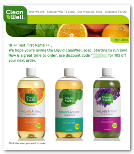
For example, CleanWell soap knows the replenishment cycle of its products and it looks to nudge customers towards a repeat purchase with a simple, perfectly timed reminder.
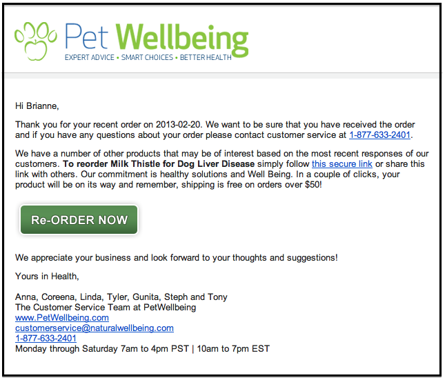
Let’s see one more example, this one from a pet health company. There are simply so many things going for this replenishment email that I wonder how many people resisted reordering through it!
The tone of the email is friendly and seems like a personal email instead of a mass blast. The customer is acknowledged by name, their last purchase is referenced, there are clear names and contact details of the senders, the customer care number is highlighted, the reader is assured that the link they’ll be taken to is “secure,” and there’s a big call-to-action button you can’t miss. Phew! Beat that one, people!
The need for instant gratification
The way we are wired, when faced with a choice between instant gratification and future gains, we typically gravitate towards instant gratification. This is evident in our generation’s choices. Be it quick fast foods over slow home-cooked meals or the popularity of instant dating apps like Tinder, waiting for things is so not our style.
There are evolutionary reasons that resulted in this impatience that we ooze every single day. By making sure that we grab resources as quickly as possible, we are pre-empting competition and storing them away for a rainy day.
Another key aspect of the need for instant gratification is the need for speed in e-commerce sites. The time taken for pages to load on mobile devices, the number of products on a page and the length of the checkout process are all indicators of how sticky the website is going to be.
Over 50% of all visitors will move on from your site if they’re made to wait for anything longer than three seconds. Tall order!
Surfboard maker Isle Surf & Sup understands the inherent lack of enthusiasm first-time visitors to websites have, and immediately catches their attention with – what else – an opportunity to win something:
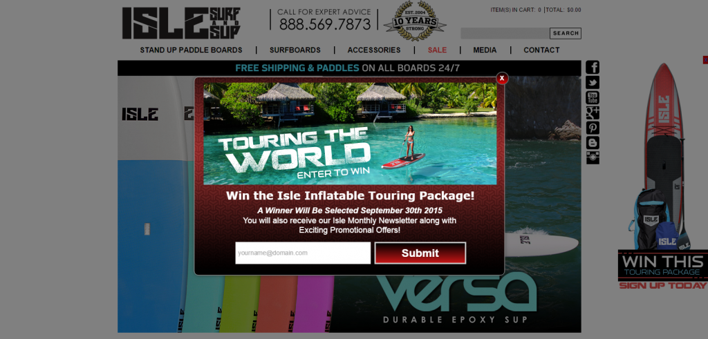
A contest is an ideal way to grab the visitor’s attention and get them to part with their email address. For added effect, there’s a sticky “touring package” on the right that keeps enticing you to sign up, should you happen to resist the initial offer.
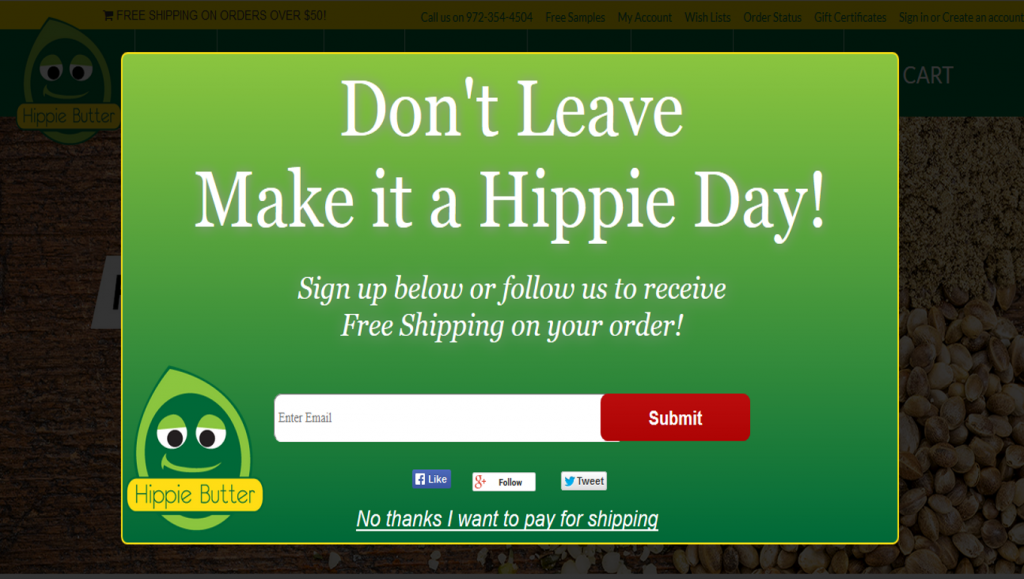
I also like the way hemp seed retailer Hippie Butter handles their visitors’ impatience. Instead of “capturing” visitors’ attention when they enter the site, Hippie Butter focuses on “keeping it” when they are leaving. When the visitor is about to exit the website, they get a lightbox overlay that offers them free shipping on their order if they sign up for the company’s newsletter or follow them on social media:
The copy is playful and in keeping with the brand’s positioning. Best of all, it grows email subscriptions while simultaneously providing an incentive to purchase and preventing a user from exiting the site.
The instant gratification drive is well directed by e-commerce leaders using tactics like charging a small premium for same day deliveries (hello, Amazon!). Shipping is a known stumbling block for e-commerce sites. While unexpected shipping costs cause shoppers to abandon carts, quicker than expected deliveries increases the chances that a customer will shop again with your site.
Zappos again is a perfect example of this. While it promises deliveries within 4 to 5 business days, the large majority of their deliveries happen overnight. It’s no wonder then that over 75% of Zappos users are repeat customers.
The wrap
It doesn’t matter how many competitors you have. What matters is how well you read your target audience. Observe their behavior on your site and off it to build a clear profile of what makes them tick and what does not. When an e-commerce site offers a user experience that they were only just thinking of, it moves up from being a site that the user shops at to being one that the user patronizes.

