News flash: e-commerce has evolved. Today’s e-commerce businesses need to showcase their products in a unique way that not only represents their brand but also primarily focuses on driving sales. Shopify Plus is a fantastic platform to accomplish this difficult task that so many e-commerce stores face.
To display the versatility of the platform, here are 10 amazing store designs created by brands and agencies on the Shopify Plus platform.
Frankies Bikinis

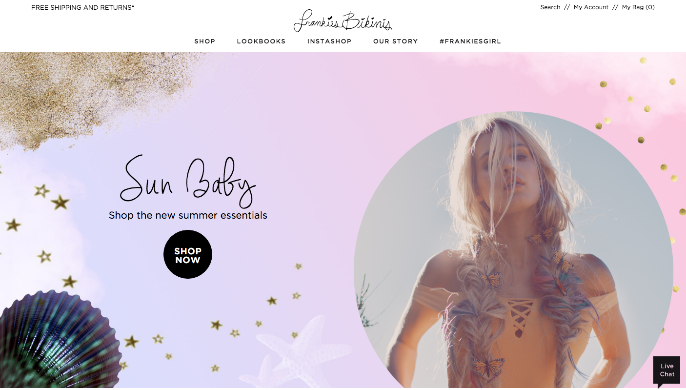
Boho-chic beachwear brand, Frankies Bikinis was started by Malibu born Francesca Aiello back in 2014. Today, the brand has grown into a global destination for hip bikini styles and other beachwear essentials.
With the help of Abby Rose Design, Frankies Bikinis was able to create a website that truly captured the essence of their brand while driving sales on the Shopify plus platform. Frankies Bikinis website features the full collection of bikinis and clothing along with stunning lookbooks.
The best part of the site has to be their Instashop. With over 615,000 followers on Instagram, it’s clear that this social channel is a primary piece of Frankies Bikini’s marketing strategy. The Instashop allows shoppers to see the exact items that are showcased in an Instagram photo and immediately add it to their cart. This removes barriers to completing their purchase and the more streamlined checkout you have the less likely you are to lose shoppers who are on the edge of converting.
Uproot
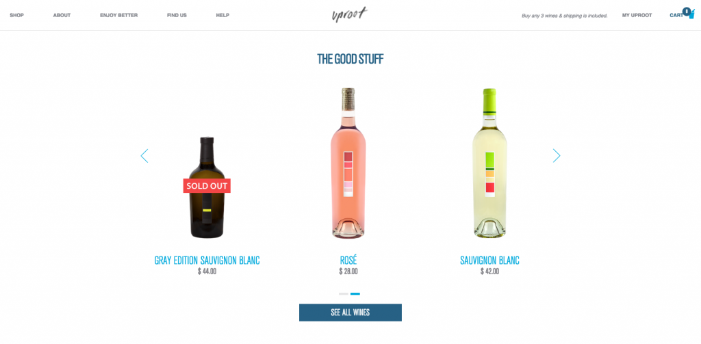
The rebels of winemaking are at it again. Uproot Wines has made a name for themselves by making direct online sales a focus of their business. This means no markup from distributors and you know what you’re getting. The most refreshing part about Uproot is their labels. Each label tells you what the wine tastes like. As a novice drinker of wine, it’s refreshing to see a brand educating people in a unique way.
Uproot’s website is designed to focus on its collection of wines. This eliminates distractions and allows shoppers to purely focus on purchasing the type of wine that they want. With the assistance of Verbal Plus Visual, Uproot has created a simple, sales focused website for their awesome collection of wines.
Death Wish Coffee
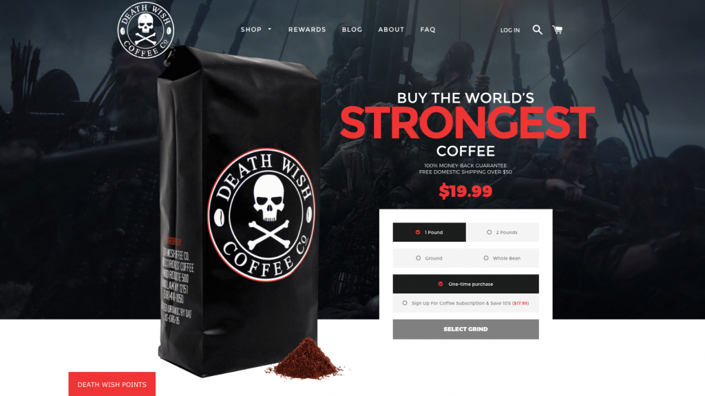
The name says it all. Death Wish Coffee caffeinates your mornings like no other coffee you’ve ever tasted. We like to bust out Death Wish when things are lackadaisical in the office and it never fails to give us that kick to get going.
Death Wish Coffee and Pointer Creative have created an innovative website that not only displays the brand but also drives sales. The image provided above is the homepage of the website. The very first thing a shopper sees is essentially a product page. This means that a shopper can add a bag of coffee to their cart in only one pageview. Talk about sales conversion-focused design!
SkinnyMe Tea
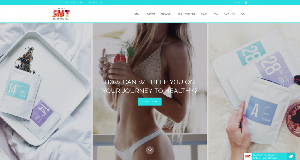
Teatox brand, SkinnyMe Tea, provides different types of cleansing teas to help people reach their health goals. They offer different types of programs in which you receive several types of tea, each with a specific purpose.
SkinnyMe Tea has grown into the leader in teatox products. A major factor in this growth has been its branding. They internally designed a visually pleasing website that focuses on their different collections of detox teas. SkinnyMe Tea also continues to differentiate from competitors through the use of e-commerce promotions.
Figs
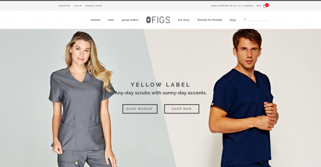
Figs have taken a rather ordinary product (medical scrubs) and added useful utility with simple style. Their scrubs feature anti-microbial material, useful storage pockets, and fashionable style.
The Figs website showcases their scrubs with great product imagery and prompts shoppers to immediately start perusing their selection. The clean website design by Fuel Made focuses on simplicity which is in complete alignment with the Figs brand.
Condor Cycles
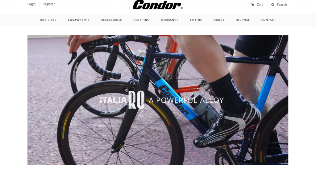
Condor Cycles specializes in creating bicycles that uniquely fit the needs of their customers. They offer a great selection of road, touring, single speed, and track bicycles while also offering the option for shoppers to build their own bike.
The Condor website covers everything from complete bicycles to clothing to product education. My favorite aspect of the shopping experience has to be the separation of different types of bicycles allowing a first-time shopper to learn more about what they want. This does add more steps to the buying process but it makes more sense to provide information to shoppers since a bicycle is a large purchase.
The Condor Cycles team, along with help from We Make Websites, understands the bicycle buying process and has catered their website experience to nurture this process.
MVMT Watches
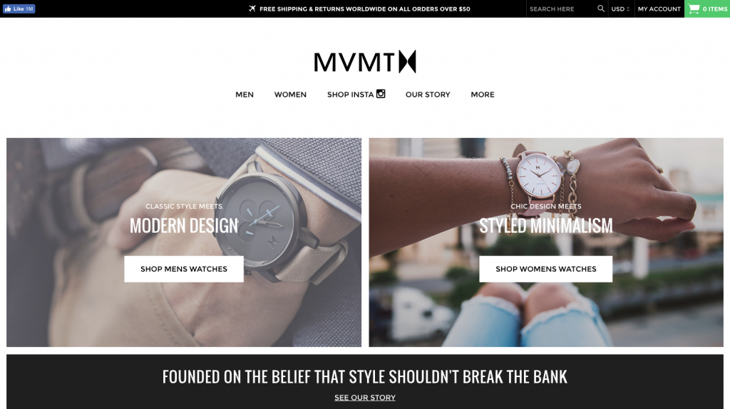
MVMT watches has quickly become a household name. They offer incredibly stylish watches at an accessible price point. With a massive following on Instagram and a pulse on timepiece style, MVMT continues to change the game.
MVMT’s website boasts great product photography which appeals to shoppers. At the same time, there’s no nonsense; The website is very product-focused. They also use their Instagram success to an advantage with a shoppable Instagram page. MVMT and design agency, BVACCEL are definitely on the rise.
BioLite
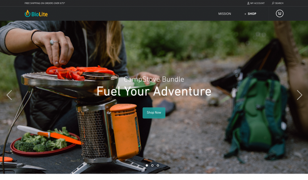
BioLite continues to revolutionize the way we experience the outdoors. Their keystone product, the BioLite Stove, allows campers to cook their meals on an easy to use stove while converting the heat into energy which can be used to charge lights and electronic devices. They also have portable solar panels and lighting accessories.
A powerful brand like BioLite deserves a great website design. With help from Fifty and Fifty, BioLite has an amazing website to showcase their products. The aspect of BioLite’s website that stuck out to me most was the product pages. The display of great product imagery, product info, and reviews are beautiful and very sales focused.
Shinesty
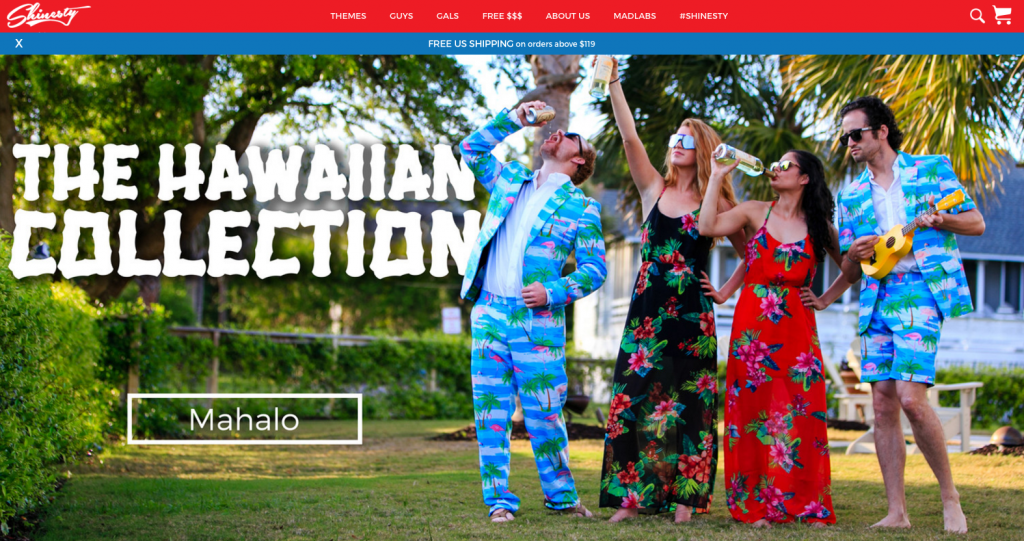
The fun and flamboyant crew over at Shinesty has created a website experience that embodies the party animal in all of us. The website showcases their different styles in the context that they should be worn in. Whether it’s making a fashion statement on the mountain or showing your patriotism with some Rex Kwon Do American flag pants, Shinesty’s fun website will keep you laughing and ultimately purchasing.
A recent addition to the website is the “You Vote, We Make” section. This allows shoppers and Shinesty fans to vote on styles that they’d like to see put into production. This experience involves customers and creates a community aspect around engaging with the brand.
Beastmode
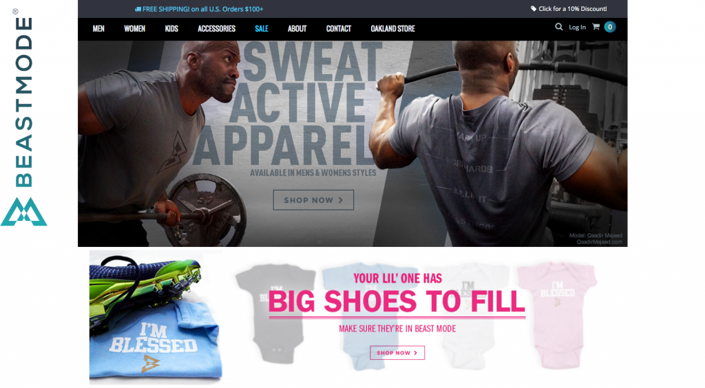
Beast Mode has to be the baddest brand on the Shopify Plus platform. NFL star and Oakland legend, Marshawn Lynch, has turned his trademark nickname into an awesome brand, Beast Mode. Now, you can channel your inner beast, just like Marshawn!
The online store is simple with straightforward product categories that provide a clear path for shoppers to follow. This is a site designed for driving sales first and foremost. The coolest section of the store is definitely the kids’ section. I think it’s time to pick up a Beast Mode onesie for your little one.
Also, if you’re ever in the Bay Area, check out the Beast Mode store in Old Oakland. It’s a very cool store located in a great part of town!
Sell in style
Whether it’s building an Instashop, a lifestyle around your brand, or taking a more traditional e-commerce approach, Shopify Plus is a versatile platform that allows you to do what you want. It’s quickly becoming the choice for many growing e-commerce brands. Contact the team for more info on Shopify Plus pricing and features.
Want to learn more about how Shopify Plus and Justuno work together, check out what makes our platforms a marketing dream team.
