In e-commerce marketing, you’re always looking for new ways to drive traffic, generate more sales and boost revenue. You run ad campaigns, create content, maybe work with influencers… anything to drum up attention and help your bottom line.
What if I told you that improving a single metric could help you increase your store performance and even improve your search engine rankings?
This metric is your bounce rate. Here’s what you need to know:
What is bounce rate?
Bounce rate represents the percentage of visitors who land on one page of your website and then leave without visiting any other pages.
A high bounce rate can signify a number of different problems with your website and the overall customer experience you provide. It can also negatively affect your search engine rankings since it demonstrates to Google that your website wasn’t particularly helpful in solving the searcher’s query.
What’s a good e-commerce bounce rate?
In short, it depends.
A good e-commerce bounce rate can differ from website to website for a variety of reasons. However, there are standards across industries.

For instance, e-commerce bounce rates typically range between 20% to 45%, according to CXL. If your current bounce rate is somewhere in this range, then you’re in good company.
If it’s higher, keep reading to find out how you can keep more visitors on your website.
7 ways to reduce your bounce rate
In this section, we’re going to discuss several strategies you can use to improve your website’s bounce rate.
1. Speed up your website
How fast your website loads can have a significant impact on whether visitors will keep browsing your website or leave. This is especially true for mobile visitors, many of whom will abandon a website if it doesn’t load within three seconds.
Slow page load times are especially problematic for e-commerce websites. Research shows that a two-second delay in load time increases bounce rate by as much as 103%, while a mere 100-millisecond delay can decrease conversions by 7%.
The best way to begin improving your site speed is to figure out how fast it is at the moment. You can do this by using a tool like GTmetrix.
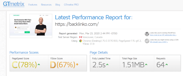
You can then implement the following changes to speed up your website.
- Switch to a different web host: While it might not be the first thing that comes to mind, your web host could actually be the reason why your website is loading slowly. Research different hosting providers and see if there’s one that could guarantee a better load time. If you’re using shared hosting, you should consider switching to a dedicated or VPS hosting service.
- Use a CDN: A Content Delivery Network (CDN) such as KeyCDN or Cloudflare can help you speed up your website by serving your website content from servers that are physically closer to your visitors’ location.
- Compress website images: Compressing your website images is an easy way to boost website speed. Use a tool like Kraken.io to compress your website images and reduce their size without experiencing any loss in image quality.
- Minify CSS and JavaScript files: A lot of bloated CSS and JavaScript files can slow down your website. If possible, combine multiple files into one and then use Minifier to reduce their size.
2. Make your CTA stand out
You need to make it obvious what action you want visitors to take once they land on the page. A great way to do this is to ensure your call-to-action (CTA) stands out.
When designing your CTA, use a font or color that contrasts with the rest of the product page. Consider making the CTA larger than other website elements.
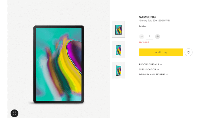
As for crafting CTA copy, try to use actionable and time-sensitive phrasing by including words such as buy and now. When it comes to positioning, you should strive to keep the CTA above the fold to make sure most of your visitors will notice it.
If you decide to use multiple CTAs on one page — which isn’t a bad idea — make sure they all prompt users to make the same action.
3. Simplify your checkout process
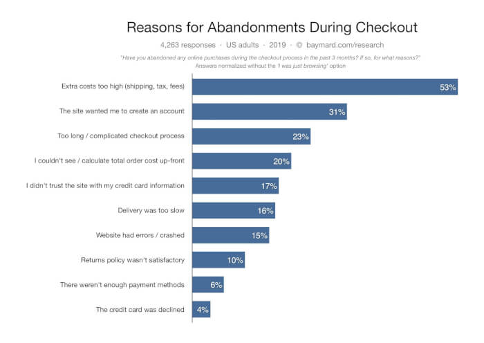
Approximately one in five shoppers who abandon their shopping cart do so because of a complicated checkout process.
If you want to reduce your bounce rate and keep as many visitors on your website as possible, you need to work on simplifying your checkout process. Here are a few ways to do this:
Remove distractions
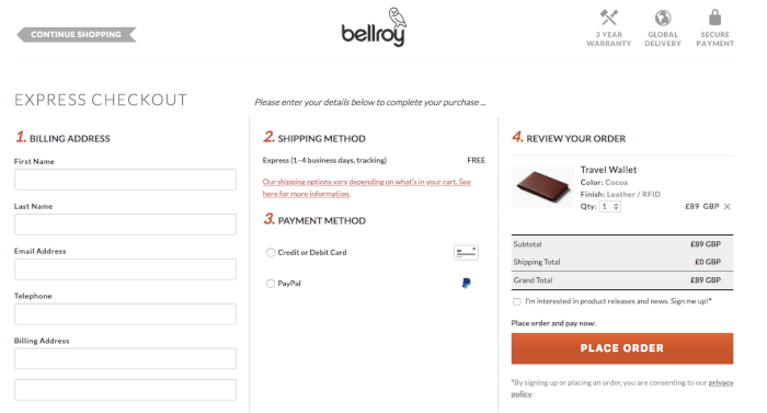
Once shoppers get to the checkout page, you don’t want anything to distract them from entering their payment information and completing the purchase.
Remove anything that might make visitors wander off to other pages on your website. This includes navigational links, the search bar, as well as any banners you might have.
Here’s how Bellroy does it:
Enable guest checkout
People hate being forced to create an account just to make a single purchase. Twenty-eight percent of shoppers reported abandoning a cart because the site wanted them to create an account first.
Avoid this on your website by allowing shoppers to use guest checkout.
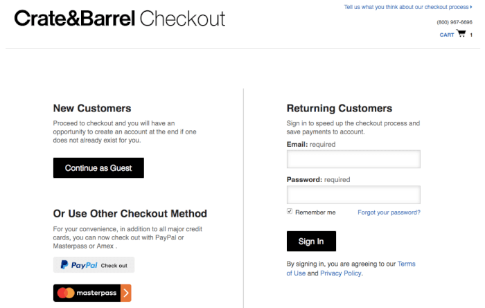
If you’re hesitant about implementing guest checkout because you want to collect customer information, note that you can ask them to create an account (perhaps with an incentive, such as 10% off their next purchase) after the sale.
Simplify the checkout form
The average checkout form consists of twice as many fields than are realistically necessary to complete a purchase. This can frustrate shoppers and lead to website abandonment.
Remove any fields that aren’t absolutely necessary for finalizing a purchase, such as the Salutation, Address Line 2 and Company Name fields. Consider merging the first and last name fields to speed up the process of filling out the form, too.
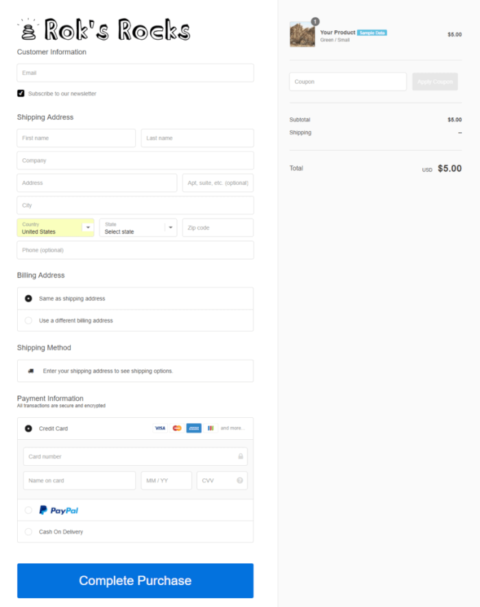
If possible, consider using an address lookup service to make it easier for shoppers to enter their shipping details. Also, make it easy for customers to opt to use their billing address as their shipping address so they don’t have to enter the same information twice.
4. Inspire trust
Shoppers are wary of entering their credit card information on unknown websites. In fact, lack of trust is the reason why 17% of all abandoned carts are abandoned.
You need to build trust with customers and make them feel more comfortable buying from you. One of the easiest ways to inspire trust is through trust signals. These are website elements that help visitors understand you’re a legitimate business.
Trust signals rely on people’s preference for zero-risk situations and their tendency to look for signs that confirm their existing opinions. Examples of trust signals include:
- Guarantees: These types of trust signals show shoppers that it’s safe to buy from your business. Examples include money-back guarantees and trust seals from PayPal, Visa and MasterCard.
- Social proof: This relies on people’s tendency to view a specific action as more appropriate because they’ve observed other people doing it. Examples of social proof include reviews, testimonials, celebrity endorsements and user-generated content.
- Signals of membership: These types of signals show that your business belongs to one or more reputable organizations. An example of such an organization is the Better Business Bureau.
- Signals of association: Similar to membership signals, signals of association show that your business is connected in some way with other reputable businesses. You can show your association with other businesses by displaying logos of the brands whose products you stock.
5. Use exit intent pop-ups
Exit-intent popups are triggered when visitors try to leave a page. They can be highly effective at keeping visitors on your website.
These types of popups can be used to offer visitors a discount in an effort to try to make them change their mind and make a purchase. You can also use exit-intent popups to collect your visitors’ email addresses so you can remarket to them later.

Pro tip: Justuno has an exit offer feature you can use to offer an incentive (in the form of a discount or a free shipping offer) to shoppers who try to leave your website without making a purchase.
6. Design a helpful 404 page
Most websites suffer from broken links from time to time. If you’ve set up your website properly, users that click on these links will end up on your 404 page.
While this hopefully isn’t a common occurrence, there’s no reason why you shouldn’t try to prevent these visitors from leaving your website and try to provide them with the content they want. A helpful 404 page can help you reduce your website’s bounce rate and improve the time visitors spend on your website, as well as enable you to generate more sales.
Design a 404 page that will help visitors find what they’re looking for by adding links to your most popular products, categories or blog posts.
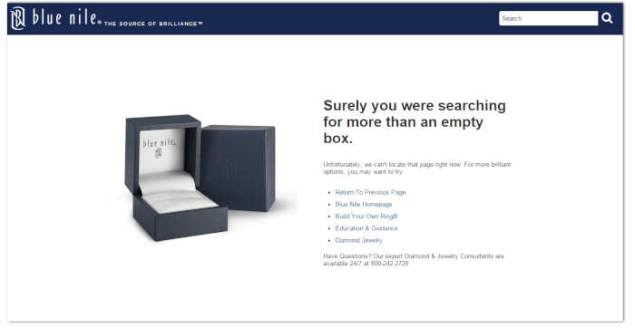
You might even point visitors to your live chat or your contact page so your support team can take over and help them find what they need.
7. Optimize your website for mobile devices
As many as 61% of shoppers state that they’re likely to abandon a website that doesn’t load properly on their mobile device, while 45% claim to be less likely to visit such a website again.
Optimizing your website for mobile devices can have a significant impact on reducing your bounce rate. When looking to improve your website’s mobile-friendliness, start by thinking about how mobile users browse the web.
Unlike desktop users, mobile visitors don’t have access to a keyboard or a mouse. They use their fingers to navigate your website, which makes mis-clicks more likely.
Keep this in mind when designing your website — make sure to use large buttons and input boxes, as well as a bigger font size to reduce mis-clicks and make your website easier to navigate on a mobile device.
Keep your e-commerce bounce rate in check
As an e-commerce business, you should constantly be looking for ways to reduce your bounce rate and keep more of your visitors on your website until they make a purchase.
Remember these key strategies to reduce your website’s bounce rate:
- Speed up your website
- Improve the visibility of your call-to-action
- Simplify your checkout process
- Use trust signals
- Implement exit-intent popups
- Design a helpful 404 page
- Optimize your website for mobile devices
Now that you know what you need to do to reduce your website’s bounce rate, go ahead and do it.


