In the digital marketing world, too many merchants and marketers throw immense amounts of money and time into their ad campaigns without spending adequate time on their onsite marketing. What’s the use of spending $10,000, or even $100,000, to get thousands of users to a site if they aren’t going to stick around? While every other metric of an ad campaign is important, one of the most important key performance indicators (KPI) is the cost-per-acquisition (CPA). 10,000 new visitors sounds great, sure, but a visitor doesn’t equal more revenue – an acquisition does.
In this article, you’ll learn how each stage of the funnel, primarily onsite conversion rate optimization (CRO), can help contribute to lower CPAs and thus help you get more from your advertising dollars. Success may be relative in life, but in digital marketing, it’s increasingly objective (and highly measurable).
First off, let’s explore the conversion rate optimization process in the context of paid ads. Search, social media, email, video, and referral links (such as from a paid sponsor) all drive traffic to your site. So begins the visitor’s first impression of your brand. Like in life, this is often the pivotal moment – do they stick around or bounce?
Far too often, paid advertisements operate in their own little silos, independent and with minimal to no interaction between them. Some may even be attempting to accomplish entirely different goals that pull in opposite directions.
Enter onsite conversion rate optimization.

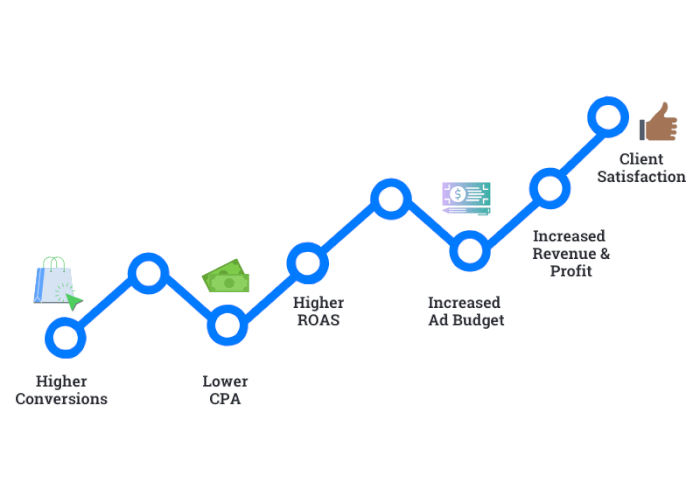
It all starts with landing pages. When you make a landing page more compelling and user-friendly, you’ll see a dramatic lift in conversions triggering an upward spiral of success:

“Alright, that sounds great, but how?”
Where it begins
In order to be effective in transforming your onsite conversion game, it starts with internal communication. Each channel’s campaign can’t be its own silo; rather, a hub-and-spoke that derives its energy from the flow of each user, driving the wheel ever onward. Each individualized channel is leading to the same result: more conversions.
Each channel needs to be aware of each other, so that if a customer is hopping around on the site, they don’t stumble upon a page that presents an entirely different brand message.
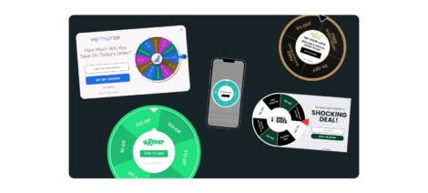
If each campaign has a different promotion or offer (as they often will), you need to then keep those visitors segmented away from the others. Don’t get me wrong, we’re not asking for 50 new website pages – it’s actually much easier. Use specific pop-ups for the same page with granular targeting rules to segment visitors as they come in.
Make use of specific UTM parameters so your site keeps track of where each visitor originates and presents them with promotions and text that brought them there in the first place.
Mirroring
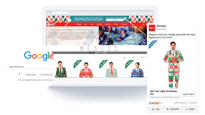
Each landing page needs to have a specific, mirrored style of copy, imagery, and (most importantly) offering for each individual channel. If an ad on Instagram mentions a free giveaway or discount, you better believe the landing page needs to say the exact same thing.
It’s imperative that you immediately reflect the same messaging that drove the visitor’s interest and subsequent click in the first place. Your landing page must meet your audience’s expectations, which were set by the creative used in your paid ads.
In this day and age, it’s not a one-size-fits-all business.
If you want to have the most effective landing page possible – you won’t have just one, either. A/B and even C test each page for each channel to ensure that each click is going further than the last. It’s a fantasy that every click will be a purchase, but that doesn’t mean you can’t drive that needle with pedal-to-the-metal brand consistency.

The How:
1. Compelling headlines
2. Clear, concise, and specific content —speak directly, to them, not about them
3. Eye-catching creative and call-to-actions
4. Answer their questions before they think of them to ensure quick purchasing decisions
Ease of use
Your page needs to be clean, simple, and directed.
How many times have you been genuinely interested in a product but been so confounded by a bad landing page or shopping experience that you leave the site, never to return? If your visitors can’t find the call-to-action, whether it’s a registration form or add to cart button, they will become disinterested or frustrated and leave.
In short? Do the thinking for them. Make each next step obvious and clear without being annoying, spammy, or condescending. This is absolutely vital for mobile shopping. They only have a few inches of space to see, so you better be sure they only see what they need to see.
Justuno makes this easy
On Justuno’s CRO platform, this is all much easier than it sounds. Utilize all available analytics (ours, Google Analytics, UTM tracking, and more) to discover what pages are performing the best for each visitor, track them as they navigate from page to page, and put the information they need (and want) right in front of them.
Online advertising is already a very difficult task with so many businesses competing in an already crowded marketplace with similar products. Standing out is incredibly difficult, so when you do, make sure you hold their attention long enough.
Combine effective messaging with consistent creative and copy to hook them in deeper. Use specific targeting to show them pop-ups that mirror the paid ads that brought them there. Be clear, concise, and do the thinking for them.
Becoming a master at conversion rate optimization is no easy feat, but one that can take business to the next level. Discuss your paid campaign goals with Justuno account manager’s and let them do the heavy lifting while our Commerce AI continually optimizes your promotions.
Justuno’s full onsite conversion rate optimization platform works wonders for digital marketers, agencies, and e-commerce merchants looking to reduce their cost-per-acquisition.


